Improving my marker rendering skill
This week I spent some time improving my marker rendering skill.
On Friday I created a fashion illustration for an outfit concept I’m working on for my course, and I spent hours on it, working to the best of my abilities to render it in colour. But after I was done, I just felt so disillusioned. It looked so rough and amateur, and it had taken me so long because I didn’t really know what I was doing.
To be clear: three years ago I would have been stunned if you’d told me I could draw something like what I drew last week. But we always strive for better. I’ve spent a lot of time looking at such beautiful illustrations, and my standards for myself have shifted.

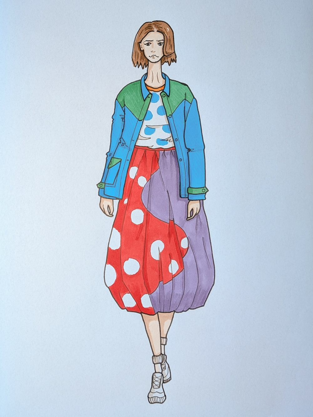
So I decided to take a day to research and practice, and then had another go at the same drawing. Although I still have a looong way to go, I’m absolutely blown away at how drastically improved it looks. The splodginess is gone, and it looks clean and bold and graphic, which is what I’d been aiming for originally. I used the same markers (Promarkers) in the same colours, the same paper and the same base outline, but the new one is so much better. I’m surprised at how much improvement I was able to make in such a short space of time, particularly in an art form that I still consider to be black magic, that some lucky people (who aren’t me) are able to tap into.
Here are the things I changed:
- Obviously I redrew the hair and face, as well as the hands and shoes. The extra detailing gives the new version more humanity which adds more of a connection, I think.
- Block out the base colours properly by really saturating the colour, and overlapping previously coloured areas as I go. I followed this tutorial on colouring large areas. This made a huge difference, as the streaky blotchy look is (pretty much) gone.
- Let the colour dry before going back in to work the next layer. (Previously I’d definitely fallen foul of this, with there being too much alcohol on the page and the colours just separating and running weirdly.)
- I learned about the tip to tip method of mixing colours in markers. Rather than colouring with my shadow colour directly, I added the darker colour to my base colour marker by holding the tips together. This created a much better tonal match between my shadows and my base colour, because the two colours are already mixed in the tip of the marker. It also meant that the colours were much less stark, allowing for softer shadows.
- I added diagonal lines in white pencil on the jacket to suggest the texture of the twill. This is pretty subtle, but it adds something.
- I used different line weights and also added more fabric movement lines. I chose a 0.7 for the main outlines, and 0.3 and 0.1 for internal lines and details. The bold outline makes such a big difference in helping the image pop, and adding ink to the creases gives them more intentionality.
My takeaway from this experience is that when I’m dreading something because I find it hard, sometimes it’s because I’ve not learned how to do it properly yet. It’s worth taking a breath, and a step back, and focusing my energies on practising, before declaring that it’s something I’m simply not good at. Skills are things you build over time.